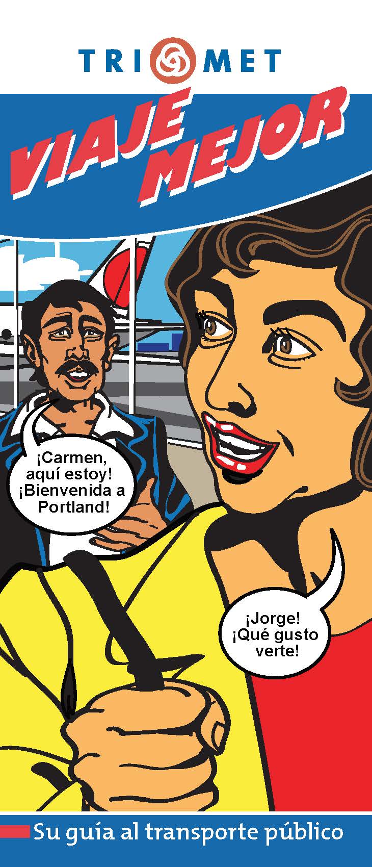
Portland’s TriMet needed a way to connect with a sizable but hard to reach segment of its ridership—Spanish speaking residents with limited reading skills. What the agency came up with was something of a “marvel” among transit communication products.
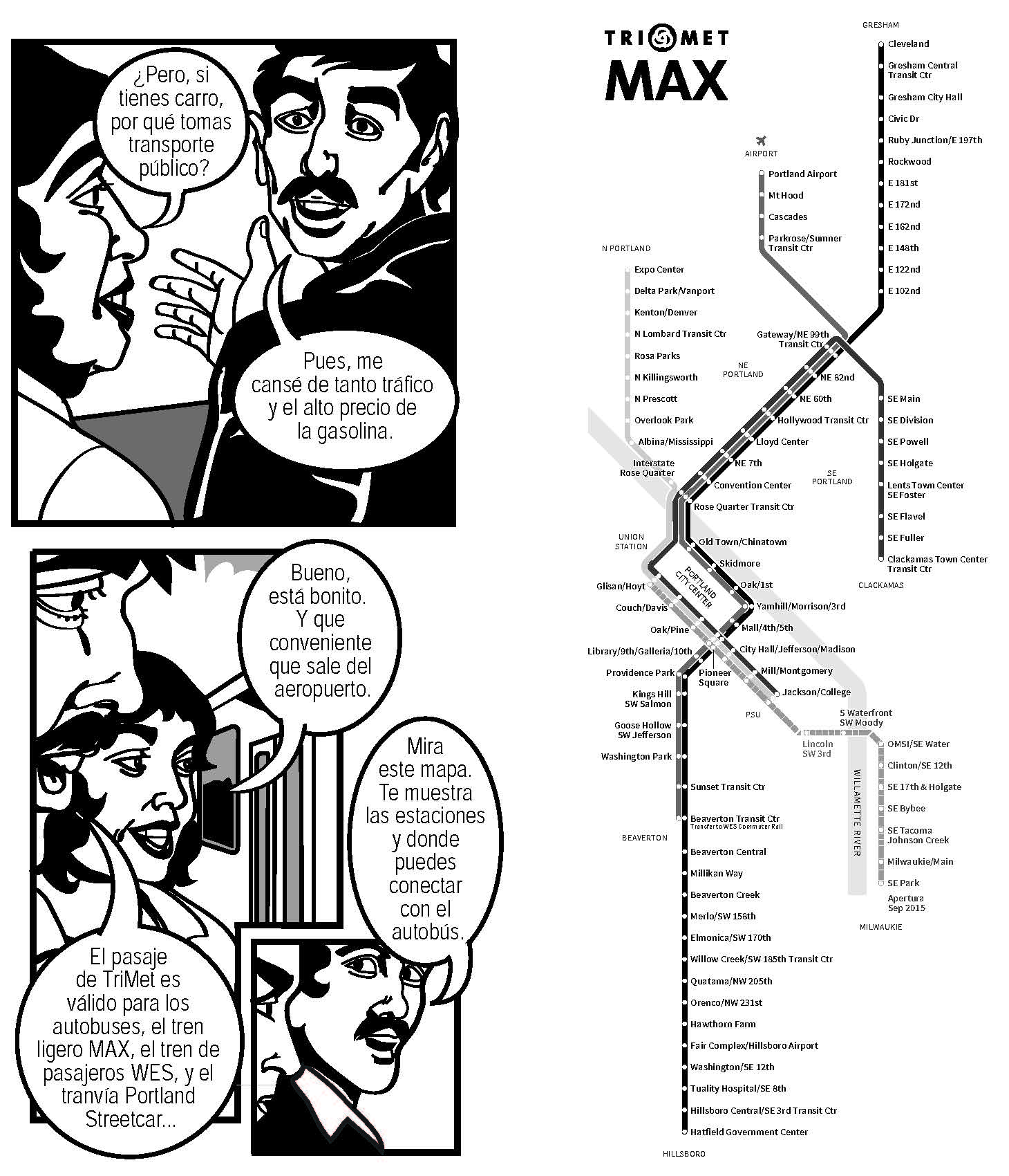
Part system guide, part comic book, Viaje Mejor (Travel Better) provides a tour of TriMet’s rail and bus network, rules for riders, payment system and more. The 13-panel brochure tells the story of Carmen, a visitor who meets her brother Jorge at the airport before heading to his home aboard the MAX light rail. Throughout the trip, Carmen asks her brother questions about the things she sees and the answers help educate readers about the system’s basics. By the end of the story, Carmen feels confident enough to ride the transit system by herself.
Just about every transportation provider nowadays translates its products for key limited English proficiency (LEP) audiences, and some have even used a comic book style for posters or other limited purposes. However, Viaje Mejor went well beyond this as the first transportation product to tell an extended story in the form of a graphic novella.
“The advantage is that it grabs your attention to begin with,” said TriMet Manager of Multicultural Outreach Martin Gonzalez, who oversaw the brochure’s creation. “And two, if you have a person who doesn’t read or write—which there are a number of within the LEP community—it provides some visual cues as to what’s expected, what’s coming or what they need to do.”
The contents of Viaje Mejor were refined through feedback collected from several meetings with LEP community members. The brochure was written and designed in-house using artwork created by a freelance specialist. In addition to TriMet facilities, the final product was distributed through local churches, businesses, nonprofit organizations, libraries and other places where Spanish speakers tend to spend time.
Geared as an introduction to the system for first-time riders, the hope was that readers would pass the information they learned on to their friends and family, as Jorge did to Carmen. Gonzalez said a key goal was to point out the unique wrinkles to the system that might catch riders off guard.

“Folks in Latin America know how to use public transit. They do it all the time,” Gonzalez said. “What’s different in our setting that is not applicable to their experience?”
The art used in Viaje Mejor was different than anything else used by TriMet. The agency has since adapted some of the artwork for displays in its facilities, such as benches adorned with the smiling faces of Carmen and Jorge riding the bus, and a Viaje Mejor brochure holder that reveals key tips for riders when the last paper copy is removed.
“We kill people with words. We do a lot of stuff in terms of print, and I’m not sure that people read the whole thing unless there’s a hook,” Gonzalez said. “[We need to ask], what is it they need? Not, what do we want to tell them.”
Karl Vilacoba is a freelance writer based in New Jersey.