Of course it does. Everything we make is the result of design. Design knows no scale. To paraphrase Walter Gropius, the founder of the Bauhaus, the most famous design school of the 20th century, design should cover everything from the teacup to the city. At the scale of the city and its infrastructure, design can be overwhelmingly complex, taking enormous time and effort. Good design must solve problems and also create aesthetically pleasing results. Society sometimes separates these two critical design elements and every generation struggles to re-balance these sometimes opposing needs. When design succeeds, it can boost the economy and provide a distinct style recognizable to future generations. And when we design exceedingly well, we build classics that deflect the wrecking ball to become timeless.

Mike Orso/TandemStock.com
The decision not to clad the George Washington Bridge
in granite contributed to its iconic appearance.
The design of infrastructure is multifaceted, requiring the efforts of many disciplines. As many human endeavors do, these disciplines fall on either side of a divide. On one side, there are those that focus on the hard numbers, that which is quantifiable. On the other, fall the soft needs, the subjective desires that are hard to measure. These disciplines align with the hemispheres of the brain—between the left, the more analytical side, and the right, the intuitive domain. As neuroscience reveals to us, we need both sides to accomplish difficult tasks.
In an era of economic restraint, budget-conscious managers resort to deploying ‘value’ engineers to review design. And while these professions review all aspects of a project under development or construction, the soft needs often fall prey first. This process often deems stylistic components a luxury the tax-paying public cannot afford. In a typical result, spaces shrink, glass areas reduce and cheaper materials replace more permanent ones. This is not always a bad thing. Many, including the 20th century’s most famous architect, Le Corbusier, applauded the Port Authority of New York and New Jersey’s cost-saving decision to not clad the George Washington Bridge with granite according to the architect Cass Gilbert’s design. Instead, the iconic elegance of engineer Othmar Ammann’s tracery of steel gives the bridge its unique style; this despite the fact that future generations must bear the cost of constantly repainting the towers.
But this story is the exception to the rule. All too often, value engineering rips at the soul of a project to the point that the public becomes indifferent, if not openly hostile, to it when finished. These constructions often need rebuilding well before a better design would have required it. No one sheds a tear at their demise, but few remember that if we invested a fraction of the rebuilding cost in the original structure, this would have in the long run been the better value proposition. Fearing the inquisition of the value engineer, designers all too often revert to taking the safe conservative route. This can result in today’s train station mimicking the glory days of rail, with designers specifying fake (and cheap) materials and forms to avoid any risk associated with attempting innovation that might reflect the spirit of the age. Fear also influences agencies to punt design to the private sector, whose hyper cost-conscious, in-house designers apply a cookie cutter formula. This results in public infrastructure of stucco-clad, closed-cell foam that looks no different than national brand fast food and convenience stores. Is this what we want to tell future generations about ourselves?
Lessons from Apple
Luckily, a national paradigm shift has occurred where design is again valued. Over the last decades, the meteoric success of Apple reflects this shift. Instead of employing value engineers to induce less cost, Apple did the opposite. It invested more to challenge its integrated and collaborative teams of computer programmers, hardware engineers, industrial designers, interior designers, architects, logisticians, packaging experts, marketers and even fashion designers to create and market the best-designed products possible.
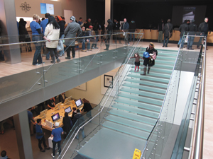
Scott Beale/Laughing Squid
Apple’s careful attention to aesthetic details for its products
and stories is partially responsible for it being one of the
world’s most successful corporations.
Apple makes no distinction in the design quality of its products, their packaging or the facilities that sell them. To do so, Apple maintains its own internal (if secretive) “university” that teaches the values of design and integration. And while Apple products cost more, consumers have opted in droves to pay for them. As a result, Apple has outperformed its competition (who now vainly try to copy them) to become the world’s most profitable corporation. America’s largest corporation has often set the ethos of a time. Let us not forget that when the Pennsylvania Railroad built its iconic stations to grace its service, it was then America’s most profitable corporation.
The lessons from Apple are many. If you build it well, people will pay for it. This should be a lesson to infrastructure builders: that service alone is not enough to lure riders. A focus on a level of service—where ‘level’ focuses not on capacity, but on aesthetic quality—is essential to promoting success. The devices Apple and its competitors make are most associated with the rising millennial generation. Nothing describes this better than Apple’s advertising silhouette of a dancing millennial with a synaptic white line connecting the device on their hip to their brain. As they eschew the automobile for mass transit, millennials will expect an Apple standard to govern the design of their infrastructure as well as the urban development associated with it. And developers should pay heed that one can already discern a distinctly contemporary tone to transit-oriented developments built for millennials when compared with locations that cater to their parents’ preference for more traditional architecture.
‘Starchitects’
It may also benefit us to dwell on the legacy of Steve Jobs and his role in Apple’s success and its parallel to infrastructure design. As both genius and impresario, Jobs firmly led scores of dedicated individuals throughout a product’s development. In this way, Jobs’s role is similar to what the press has labelled the “starchitect.” This combination of the word “star” and “architect” refer to a design leader of celebrity status whose buildings offer brand-recognition in the global competition between cities and even countries. Much criticism of the starchitect has circulated of late, with critics arguing that a small cabal of starchitects limits competition, locking out those without celebrity status and thereby inhibiting creativity. Many also argue that consolidation of power in a single individual leads to arrogance and that non-hierarchical teams are the way of the future.
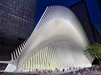
Santiago Calatrava/Courtesy of Silverstein Properties
Santiago Calatrava’s World Trade Center Transportation Hub
design emulates a bird in flight.
A starchitect often mentioned in transportation circles is Santiago Calatrava, architect for the Transit Hub at the World Trade Center. Professionally trained in Switzerland and Spain as both an engineer and architect, Calatrava has established a signature style of biomorphic, all-white bridges, train stations and museums, among other structures. This repertoire of experience led the Port Authority to select his firm early on in the design process.
As the station’s superstructure rises and portions of the project open to the public, critics are questioning everything from the difficulty of maintaining white marble to the inappropriate grandeur of the structure in such a solemn location. Significant cost overruns at the Transit Hub have stirred this foment and called out the value engineers. In Calatrava’s defense, many of the budget issues were beyond his control on a project of unprecedented national significance, and Calatrava has successfully managed the value engineering process to keep the spirit of his firm’s design intact. And the public, who have only yet seen fragments of the design, may not be able to comprehend its true worth until the entire site is open. However it plays out, Calatrava’s train station will be a future case study on the role and power of design on such a highly charged site. It is hard to imagine a structure as significant as the Transit Hub without Calatrava’s leadership, whether we call him a starchitect or not.
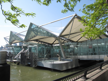
The ferry terminal at Battery Park in New York City.
Produced largely outside the limelight, the site already hosts a case study for successful infrastructure design. Under the quiet guidance of Robert I. Davidson, chief architect of the Port Authority, the agency quickly restored train service and built a series of temporary stations of noble proportions and subtle elegance using inexpensive materials. The dignity of these fleeting stations offers us evidence that good design under great scrutiny can occur without permanent materials, the lavish outlays of money or the guidance of a celebrity architect. The American Institute of Architects recently acknowledged Davidson along with the other starchitects designing for the site. A similar project is the nearby Port Authority Ferry Terminal at Battery Park City. Designed by Davidson and his in-house staff for a constantly moving and harsh environment, the floating ferry terminal works flawlessly and looks as good today as the day it opened in 2009.
Design can also be a catalyst for value. The goal of every transit-oriented development is to use public investment to spur private growth. A very recent example of this is the transformation of Denver’s Union Station from simply a transit asset to a civic asset. Skidmore, Owings & Merrill, led by principal Roger Duffy, is helping expand the 1914-era station to include a multimodal transit hub for buses, light rail, commuter rail and Amtrak. By 2016, the complex will be the hub for four new commuter lines, including one to Denver’s Airport. Duffy’s design includes a curving biomorphic fabric canopy that complements the older station, which Tryba Architects and JG Johnson Architects, two Denver firms, are repurposing into a mixed-use boutique hotel. The station expansion, which bears a striking similarity to a Calatrava design, sits atop a light-filled bus station and attaches to a landscaped promenade designed by landscape architects Hargreaves Associates.
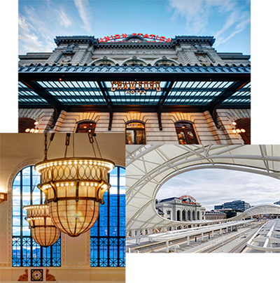
Ellen Jaskol
Denver recently opened a new multimodal hub across from the 100-year-old
Union Station, which has been converted into a boutique hotel.
As good as they are, the dramatic changes at Union Station only tell part of the story. The bigger story is the $1 billion in economic investment the project catalyzed, which is projected to lead to 2 million square feet of mixed-use development by 2020. A Whole Foods will anchor the development, which has spurred a 35 percent increase in property values even before completion. Through coordinated efforts led by the Denver Union Station Neighborhood Development Company, the project has not only shifted the city’s center of gravity to what was a marginalized area, it has spurred growth along the light rail and commuter lines that lead into it.
“Union Station is the juggernaut of development in downtown Denver at the moment. And that’s saying a lot, considering how much building is going on throughout the city’s urban core,” Ken Schroeppel, urban planning blogger and a member of the University of Colorado at Denver faculty, told the Architectural Record in April. While it may be impossible to put a precise dollar value on the role that good design and planning play at Denver’s Union Station, it is highly likely that the benefits to the city, both monetary and not, will far outstrip any additional cost paid for quality design.
Stations Project the Values of an Age
It’s hard to imagine our society intentionally demolishing Calatrava’s Transit Hub or any other structure at the World Trade Center site. Events have made those sites sacred and that status protects them. But as good as it is, Denver’s Union Station may never reach “classic” status and one day builders might demolish it for some future form of urban development. We did, after all, demolish New York’s original Penn Station. Only after its loss and the inferior design of its replacement was presented did we recognize Penn Station as a classic. And that recognition caused an aggrieved New York to form its Landmarks Preservation Commission to prevent the loss of future classics. It worked; the commission’s efforts survived a U.S. Supreme Court challenge to save Grand Central Station. New York’s transit authorities have lovingly renovated Grand Central and today it basks in its classic status, heavily used while still telling the story of its past glory.
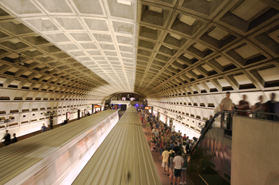
WMATA Photo by Larry Levine
The arching underground vaults in the Washington, D.C., Metro system pay homage
to Union Station and the Capitol. Seen here, Smithsonian Station.
A more recent project has emerged as a classic: Washington, D.C.’s Metro rail transit system. The Metro, which debuted its first segment in 1976, was recognized this year by the American Institute of Architects with their Twenty-Five Year Award, conferred on projects that have stood the test of time for at least 25 years. The AIA described it “as an architectural design of enduring significance” and went on to paraphrase many of the points that Zachary Schrag chronicles in his book, “The Great Society Subway.” Primary among these is that the system’s coherence is immutable; its stations, whether underground, at-grade or elevated, share common design elements and materials that make each space navigable and understandable. These design elements, created by the system’s architect, Harry Weese, over 40 years ago, still guide designers today as they complete its newest Silver Line stations.
The Metro’s coffered concrete vaults hover above platforms clad in granite and bronze and provide an unmistakable monumentality that also serves multiple purposes. Historically, the coffers not only pay homage to Union Station and the Capitol; they also serve a technical function in providing a surface for acoustical panels and in lessening the amount of concrete used without decreasing strength. And in their exacting repetition, the coffers symbolize the individual members of American society working together toward a common good. The stations give monumental dignity to the humble task of public transit: “gravitas fit for the nation’s capital,” as the AIA describes it. Alongside the Eisenhower Highway System, the Metro immortalizes the social and technological achievements of the Great Society such as civil rights and putting a man on the moon.
These lofty notions are all the products of the thoughtful if not at times willful efforts of both the designers and the leaders within the ranks of the federal government guiding them. In an exchange that seems unthinkable today, members of a federal commission leading the design were concerned that Weese was bowing to value engineering pressure and harangued him into spending more money. Otherwise, they feared the project would lack “the dignity and prestige required for a state-of-the-art mass transit system in the most powerful city in the world.” The commission needed to remind Weese that the federal government hired him to design a classic that would speak to the ages.
The Washington Metro will tell future generations about the Great Society in the way that Charles L’Enfant’s urban design recalls the republican ideals of Washington and Jefferson. In its physical construction we can observe a harmonious blend of both its technical and cultural features. And like Denver’s Union Station, the Metro’s great design continues to fuel a churning engine of economic development. The Metro was the beneficiary of strong leadership from its designers and its clients. Today, those finishing World Trade Center projects face a similar challenge. As we emerge out of a recession and begin long needed upgrades to our infrastructure, we should look around and become better aware of the ethos of our time, as cultural icons such as Steve Jobs understood it. Jobs instinctively knew that design mattered, whether it be of the tiniest silicon conductor or the infinite space of the data storage cloud, whether it be the store where you purchased your laptop or the box that it came in. Design matters. Yesterday, today and tomorrow; it really does.